THE TORMENTOR
When we designed a previous model called the Solent, it came off the back of a tumultuous time in our design trajectory - the products we were creating weren’t having the impact we had hoped for. It wasn’t until a discussion about what we wanted to be, as Marloe Watch Company, that we were able to refocus and properly start finding our design DNA. The Solent was the first of these designs to appear, and it was intended to be the basis upon which we’d build a whole series of interesting watch designs.
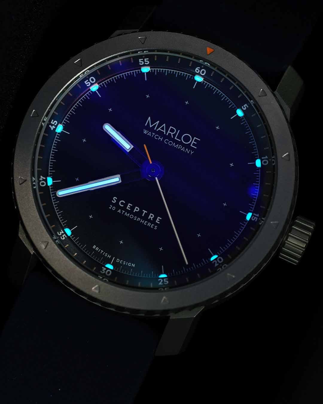
The Sceptre is the next watch from the Solent DNA stable. Featuring the same architecture but building upon that unique foundation, the Sceptre is the natural progression of the range; more robust, more capable and more striking - the Sceptre is an aggressive ocean-faring watch that’s built for the harshest environments.
Because the Sceptre was borne of iteration, rather than ideation, our inspiration delved into the depths of the ocean. The Solent was inspired by the goings-on up on the marine surface: Sir Alex Rose and Lively Lady, sailing and lighthouses. The Sceptre dives under the surface, one could say sub-surface, and looks at the world underneath the waves, where mother natures still punishes those who take her power lightly.
We’re delighted to see the Sceptre finally leaving our shores and heading into the deep - it’s a beautifully aggressive yet wonderfully wearable watch, and we hope you like it.
To the future, and whatever it may hold.
OLIVER GOFFE - OPERATIONS & MARKETING
There’s a reason that Marloe is regarded as the most customer-loyal and friendly watch company around. It’s because of Oliver’s unwavering commitment to doing things the right way; he could be called a perfectionist, but we prefer to call him immensely pernickety.
GORDON FRASER - CREATIVE & PRODUCTION
Design through immersion is what makes each Marloe watch unique. A professional empathiser, Gordon highlights the spirit of pioneering, human endeavour and love of discovery in everything we do. A patriotic Scotsman, lover of pretzels and whisky. Maybe jazz too.

AGGRESSIVE DESIGN
The world beneath the waves is not a place for the faint-hearted - it’s a dangerous place, obviously, but formidable, challenging, changing and complicated too. Whilst the Solent range was designed to be worn whilst carving through the surf above, the Sceptre has built upon this framework to deliver a watch more capable of surviving in the depths.
The case frame has remained more or less the same as the Solent, but we’ve adapted the upper section to feature a striking bi-directional bezel with rifled grips. We’ve also taken up the additional depth with a more rugged Sapphire crystal and bolstered the strength of the case sides to make this watch capable of reaching 20ATM / 200m depth.
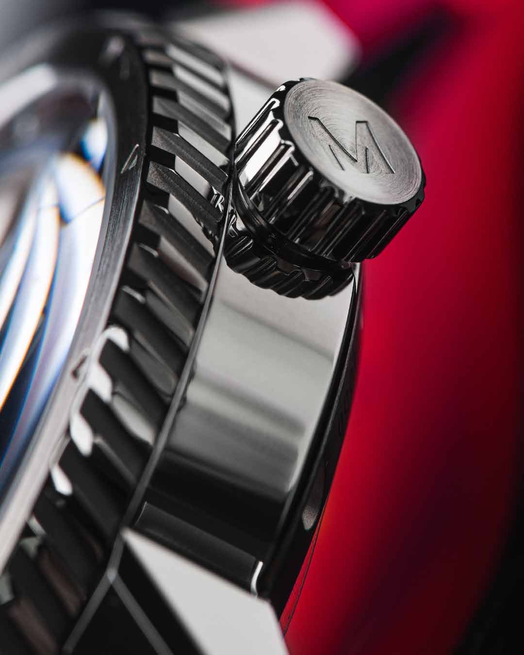
The crown, sized for grip and designed for wet fingers, now features a screw-down mechanism to increase that water-resistance rating and to keep things locked in when the action is ramping up. The same bold, angled lugs point sharply downwards and feature faceted edges and top surface, to catch the light.
Finally, we have the dial design; the part we look at most has been designed from a position of absolute clarity - an elevated, chamfered ring leads down to a drop where small pontoons of luminous compound extend from underneath. The dial is flat and uncomplicated allowing the hands, extensions of the Solent’s map divider design, to now include luminous filling for low-light capability.
Read on to discover more of what has made the Sceptre what it is.

TURBINE BI-DI BEZEL
When we were thinking about the design of the Sceptre we knew that it had to be capable of reaching the depths, but also have the feel of a more “traditional” sub-surface watch. We had experience with our Morar range of 300m-rated “proper” divers’ watches and we knew that the general use for the bezel was to time land-based activities, like meetings, schedules and eggs.
The Sceptre isn’t strictly a dive watch, given that it’s rated to “only” 20ATM, and when we really thought about what a bezel on a watch is used for, making it uni-directional and featuring a 60-minute scale seemed a bit pointless for this design. We wanted the Sceptre to be useful, and that meant making the bezel useful too. So we did.
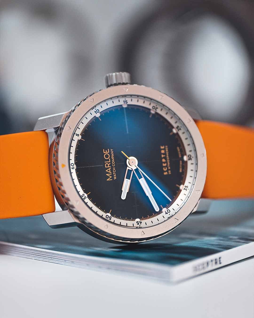
Turning both clockwise and anti-clockwise, the bezel on the Sceptre clicks 60 times - once per minute - and features etched arrows at each main hourly point; 12 triangles in total, with only one painted in a contrasting colour. This allows the wearer to turn the bezel freely in both directions and set any of the arrow points where they would like - and gives the user the ability to easily track forwards or backwards each hour, or each 10-minute interval, fore or aft of the painted marker.
The rifled grip on the bezel gives a subtle nod to our beloved Morar, but takes on an altogether more aggressive stance - looking similar to a turbine inside a nuclear submarine. This angled, chamfered grip makes turning the bezel effortless.

OVER ENGINEERED
The case construction has been beefed up to offer increased wall thickness, while the crystals we’ve used are that bit thicker than those on the Solent to protect the transparent apertures from the crushing force of the deep.
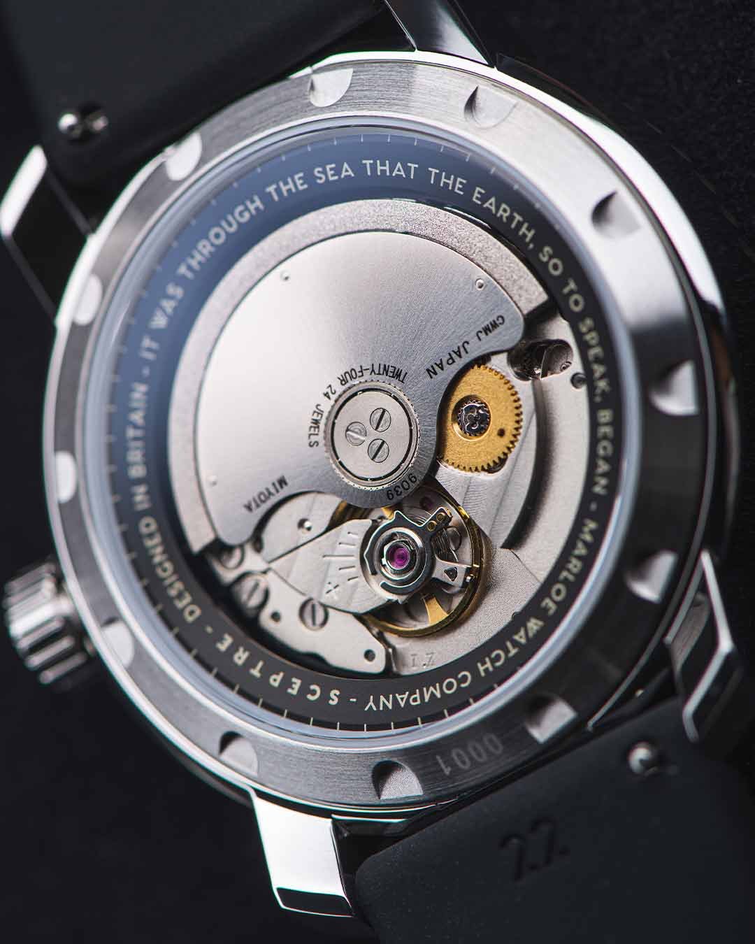
The case back features a screw-down mechanical seal with 12 tool positions that, when removed, allow the dial module, including the movement, hands and dial parts, to be removed from the rear of the case, making servicing and maintenance convenient and easy.
Finally the crown, which looks a lot like our Solent crown but now has the extended ability of being screwed into the case, adding another layer of water resistance and sealing. Given that the crown is the most vulnerable part of a wrist watch, we’ve made the thread post for this mechanical seal a bit longer to give us that extra bit of security.
All in all, the Sceptre will survive down to 20ATM, but that only matters if the person wearing the Sceptre can survive those depths too... for all other environments this little beast of the sea will do just fine.
UNDER THE GLASS
The dial is the most important part of a watch, we think, because of the proportion of time you spend looking at it, compared with the rest of the watch. It’s the functional side of these mechanical wonders - the reason it’s on your wrist: time.
The Solent was our most clear and clean dial design to date; legibility is always high on our agenda but the Solent range took that to its natural nexus. The Sceptre builds on that with a few aesthetic tweaks and some functional ones too.
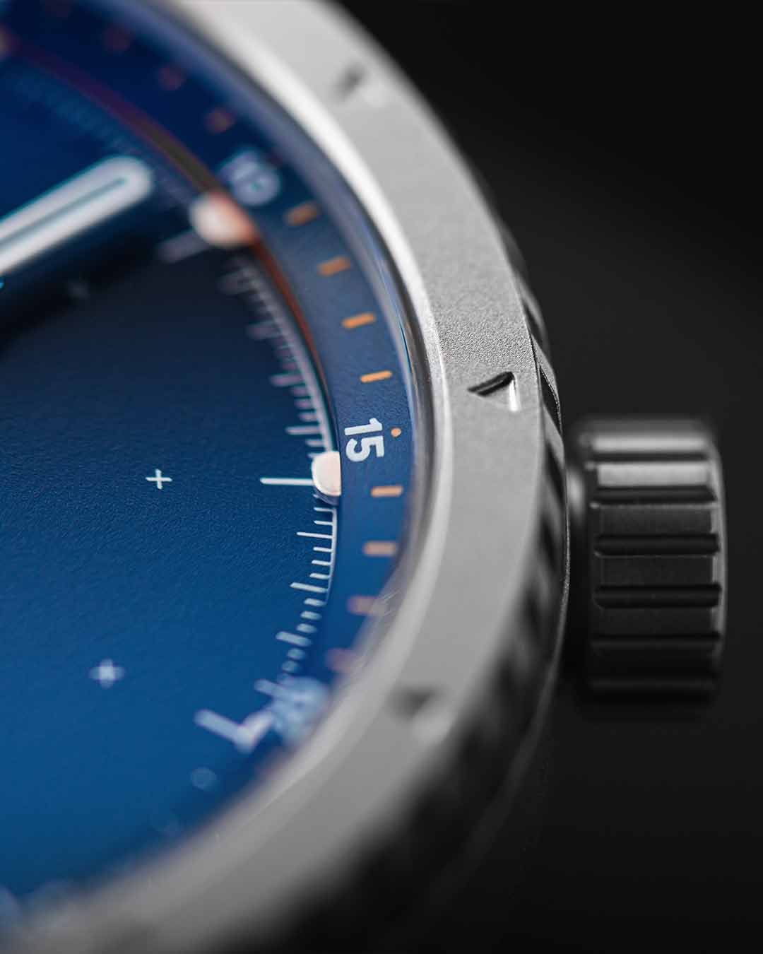
Comprising a multi-part construction, the dial starts with a chamfered chapter ring featuring 60-minute/second numerals and main minute/second marks in a contrasting colour. The edge of this chapter ring is metallicised and coloured to match the dial accent colour. Underneath this is a luminous ring, mostly hidden from view, with small pontoons that extend outwards above the main dial, allowing the small pads of luminous compound to be exposed to the light.
Then finally we have the main dial with a more complex graded minute track around the perimeter, and small cross-hairs inside - matching the throw of the hour hand - to give extra clarity to an already precise dial layout.
The hands are an extension of the Solent’s design, with added luminous in-fill and finished in various complementary tones, whether polished steel, matte black or, in the case of the Commander, dial-matched blue. It’s a super clean arrangement offering multiple layers of interest and functionality.

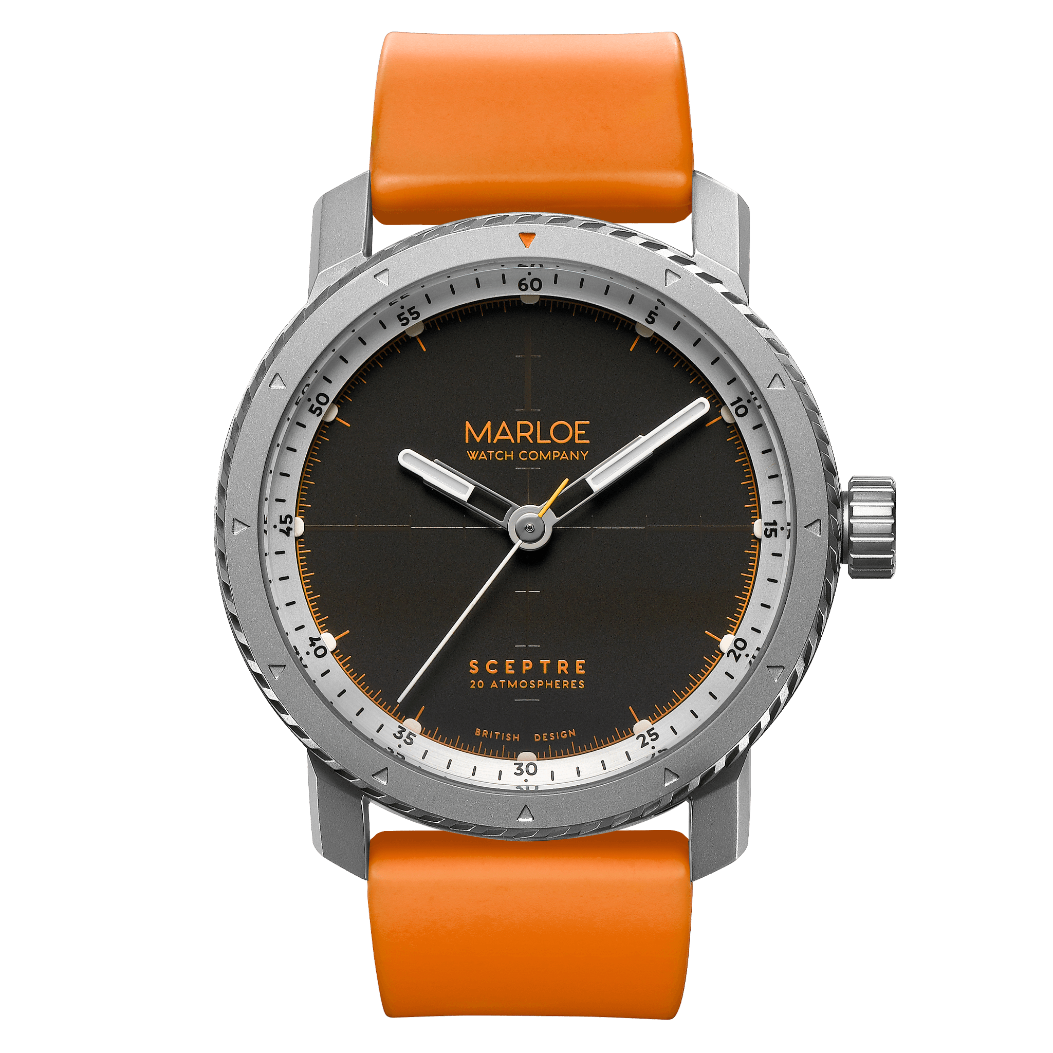
OCTOBER
In the course of our research into the Astro project, we went head-first into the realms of the Cold War and the subterfuge and espionage that were part of this simmering conflict of two superpowers.
The concept of the October takes the soviet arm of this conflict and applies the aesthetic influence from the submarines of that era, as well as referencing the overall Soviet aesthetic of concrete, steel and brutalist architecture.
The design of the October’s printing on the main dial is different to the other designs, featuring a reticle sight in subtle gloss print at the cardinal points on the main dial. This mimics the measurement scale of the periscopes used by submarines to remain sub-surface but observe what’s happening above the waves.
A colour scheme of black/brown, vivid orange, brushed steel and glossy white makes this dial a bold yet neutral design and, coupled with the orange paint-filled triangle on the bezel and the orange silicone strap, the October has great wrist presence without being garish. Why October? Well, that would be stating the obvious, Mishter Ryan.
The case and bezel of the October are fully matte blasted stainless steel 316L, a marine grade steel to prevent rusting when exposed to the salty atmospheres of coastal operations.

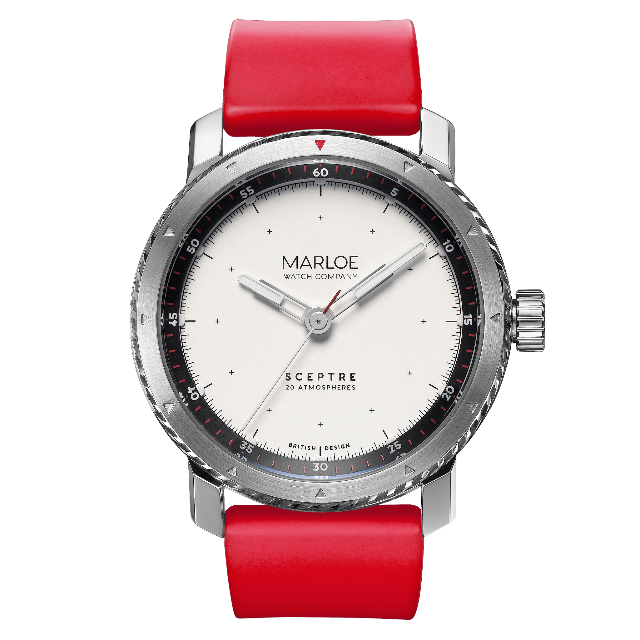
AGGRON
When we consider big naval powers, we might think of the Royal Navy, but we probably think of the US Navy more, due to popular culture and the abundance of material available online.
The concept behind the Aggron is the awe-inspiring power of the US Navy and the incredible machines that they have at their disposal. The US military also deploy special training methods to make sure their abilities are unmatched - so-called “aggressor squadrons” mimic the tactics of the enemy during training to give the operatives the best chance of succeeding in active combat.
Clean and precise, the Aggron dial features a black outer chapter ring with white and red printing. On the side of the ring is a metallic blue edge, with the luminous pontoons below leading to the pristine metallic white dial with black printing.
A colour scheme of red, white and blue makes this dial a bold yet refined visual spectacle. The Blue AR coating, coupled with the red paint-filled triangle and matching silicone strap complete the set.
The case of the Aggron is a polished chassis with the bezel featuring blasted recesses on the grip and a radial brushed finish to the top surface. Stainless steel 316L, a marine grade steel, is used to prevent rusting when exposed to the salty atmospheres of coastal operations.

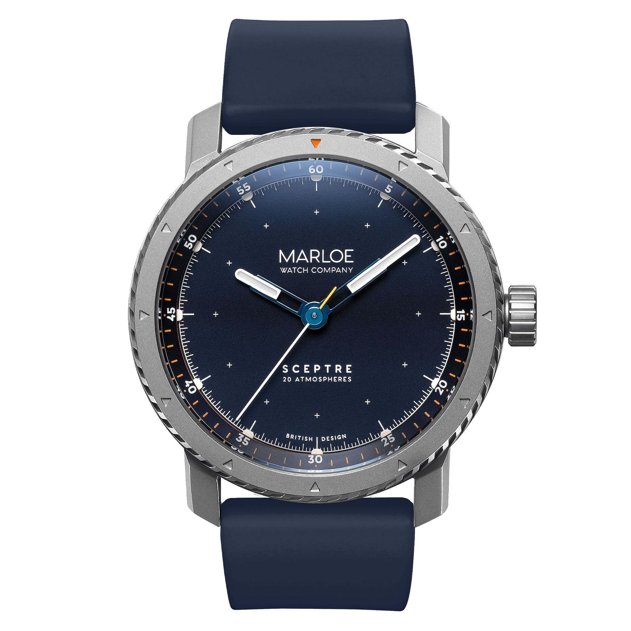
COMMANDER
What better word to use for this, the British-inspired Sceptre, than “Commander”? This was the original design and colour scheme for the Sceptre we penned back in the concept phase, and it has remained true to production, mainly due to the damn good-looking combo of colours.
A deep blue, slightly metallic dial and outer chapter ring are the canvas upon which bright orange and white markings are festooned. The deep ocean blue works spectacularly with the blue AR coating on the crystal, morphing the dial from almost black to a bright vivid navy blue - it’s a visual treat. The chapter ring features a bright orange metallic edge, adding a bit of visual sparkle not just through the crystal, but in the refractions at oblique angles too. It’s a magnificent, layered spectacle.
The skeletonised hands on the Commander feature a first for us - a polished blue finish. Like the dial, the hands morph from black to bright vivid blue depending on the angle of the light, and feature white tips with luminous filling. The running seconds hand features a two-tone colour scheme, with white for the long side and vivid orange for the counter-weight.
The case and bezel of the Commander are fully matte blasted stainless steel 316L, a marine grade steel to prevent rusting when exposed to the salty atmospheres of coastal operations.

BLACK EDITION
What more can we say about the Black Edition other than it’s becoming a bit of a thing? What began as a special edition Haskell has now spawned multiple versions of this inimitable colour scheme, including a Coniston, Morar and now a Sceptre.
Like the other Black Edition designs, the Sceptre edition features matte black dial, chapter ring and hands. The faded gold printing on the dial, chapter ring and case back pop in the darkness, with the glossy white of the hand tips and luminous pontoons giving the clarity specs a massive boost. This is an incredibly easy to read dial design.
There’s something wonderful about the combo of black dials and blue AR coated crystals, and with the Black Edition we get a wonderful taste of the spectrum of deep water colour, when the light catches just right, and we’re treated to a visual trick of the eye: a vivid blue flash, a blue to black gradient and a strip of jet black on the dial surface. You could say this one is our favourite, but that would be unfair to the others.
The case of the Black Edition is a polished chassis with the bezel featuring blasted recesses on the grip, and a radial brushed finish to the top surface. Stainless steel 316L, a marine grade steel, is used to prevent rusting when exposed to the salty atmospheres of coastal operations.
OPERATING THE SCEPTRE
WINDING THE MOVEMENT
POWERING YOUR SCEPTRE
Inside your Sceptre is a Miyota 9039 automatic mechanical movement. The movement is powered by your every move; each swing of the arm, each flick of the wrist or each step of your body injecting power into your Sceptre.
Wearing your Sceptre every day keeps it ticking. You can of course manually wind the movement and this can be done to top up every day or just to feel the movement between your fingers.
If you do want to manually wind your Sceptre, feel free. Unlike our manual movement watches, the Sceptre doesn’t come to a hard stop. You can wind forever and ever, for there is a clutch attached to the automatic rotor mechanism that prevents over-winding.
You must first unscrew the crown from its thread (a preventative measure for water resistance). Once it’s unscrewed all the way, you can wind away and enjoy.
A fully charged Sceptre will keep ticking for over 42 hours. Quite awe-inspiring considering it’s all down to the tiny mainspring, slowly uncoiling.
CHANGING ThE TIME & DATE
A SIMPLE PROCESS
The 9039 is an automatic movement with 3 hands, and has a very simple setting process.
Pull the crown all the way out, which will stop the seconds hand moving (hacking function) and allow the hour and minute hands to be set.
Progress the hour and minute hands around the dial. Simply set the current time and, once happy, push the crown all the way in again. This will kick the seconds hand into life again, showing that your watch is now accurate, on time and under power.
Remember to screw your crown back into the case in a clockwise direction (when looking face on at the crown), so that the watch is now protected and can achieve the full 200m water resistance.

SPECIFICATIONS
-
42mm diameter x 12.65mm depth
22mm strap width
Dual-texture bespoke designed case w/screw-down crown
Sapphire crystal with dual side anti-reflective coating
Multi-layer dial with applied indices & polished chamfer
Divider hand design
Hairline seconds hands w/counter-weight & arrow tip
Luminous hands and dial perimeter
76g
20 ATM
-
Miyota 9039 automatic mechanical movement
28,800 bph
24 jewels
Handwinding override capability
40+ hour power reserve
-10 ~ + 30 sec/day
Japanese Made
Hacking function
Parashock anti-shock
-
A mechanical movement, like a car engine, uses oils to lubricate the moving parts. Over time this fine grade of oil can become gloopy, causing your movement to lose accuracy. Every 4-5 years, think about having your watch cleaned and re-oiled by a professional - it’ll keep everything ticking along nicely.
The Sceptre enjoys a 2-year limited warranty which covers manufacturing defects. T&C - see our website.
